← Selected Work
Consumer · Global Campaign · 2025
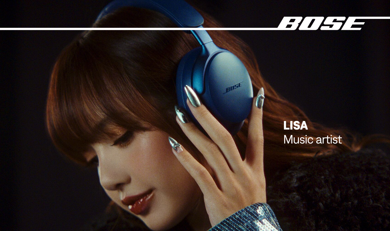
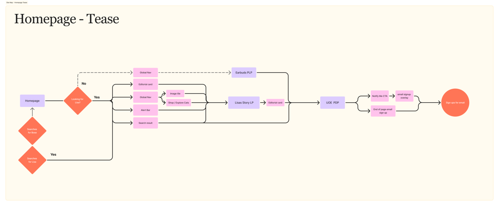
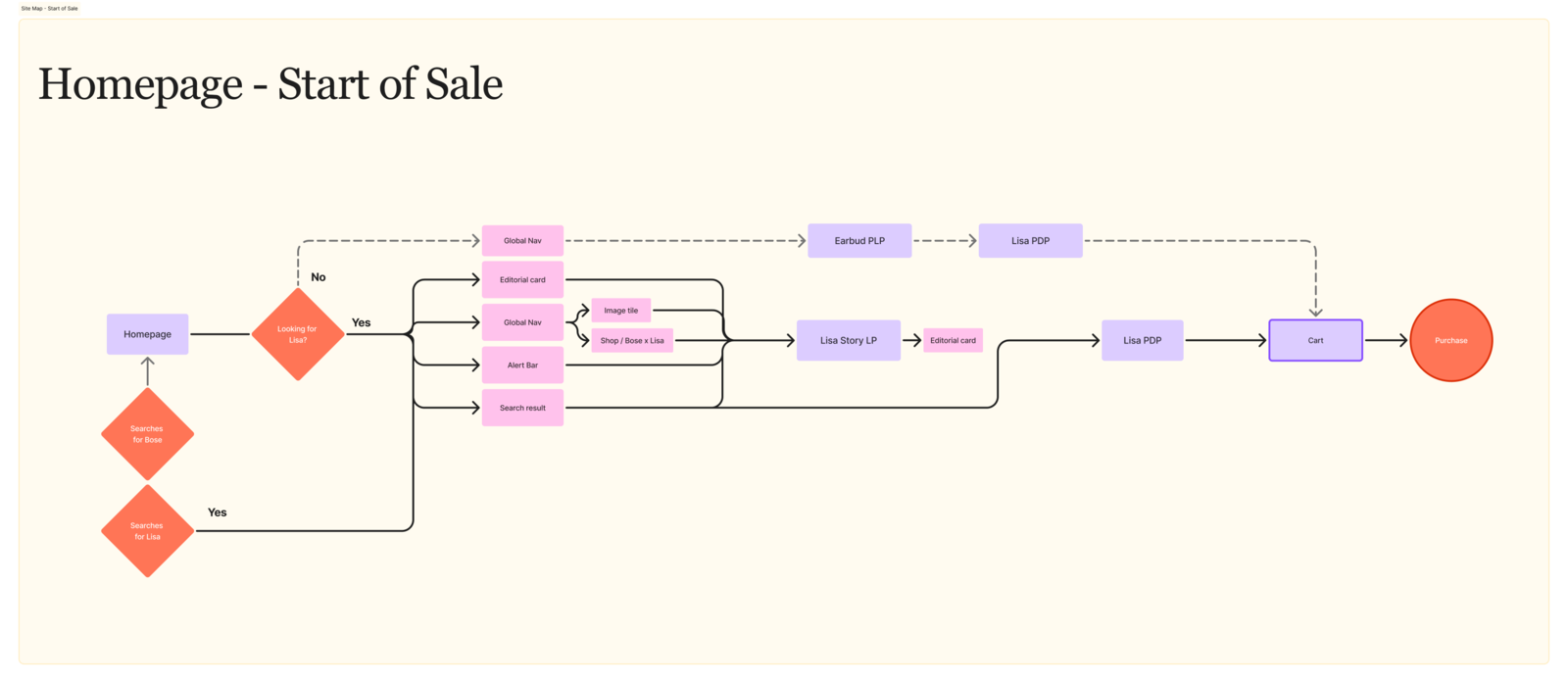
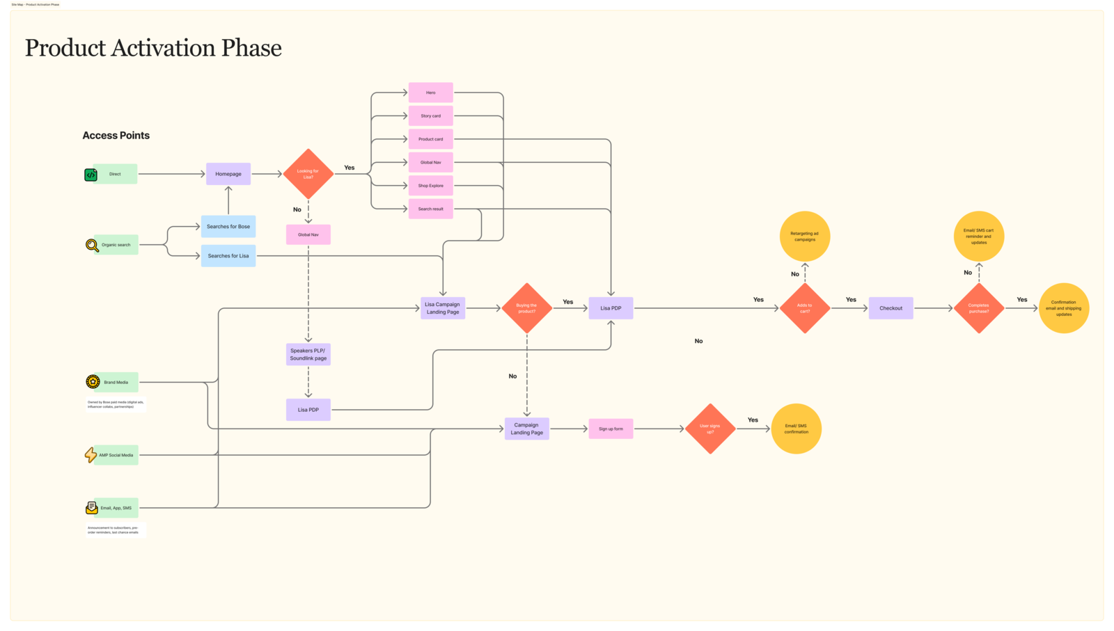
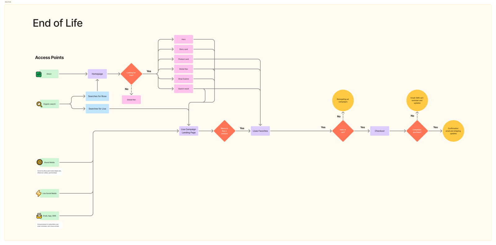
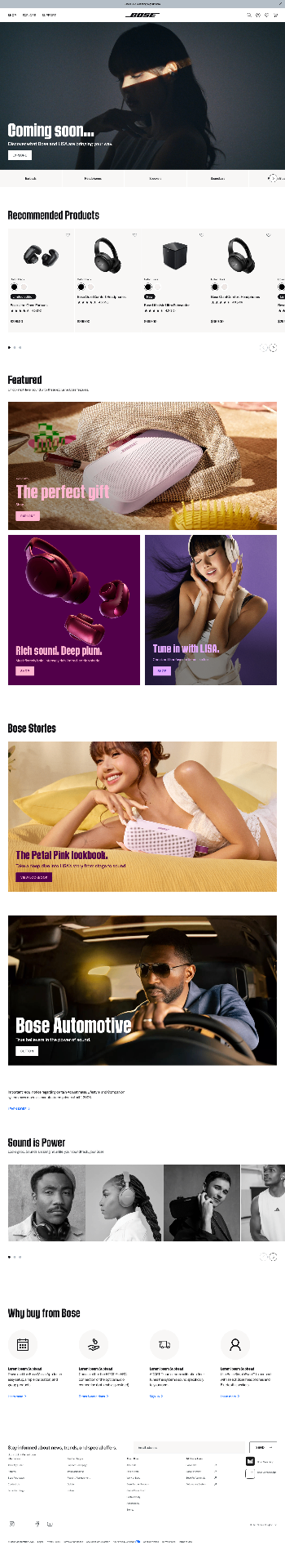
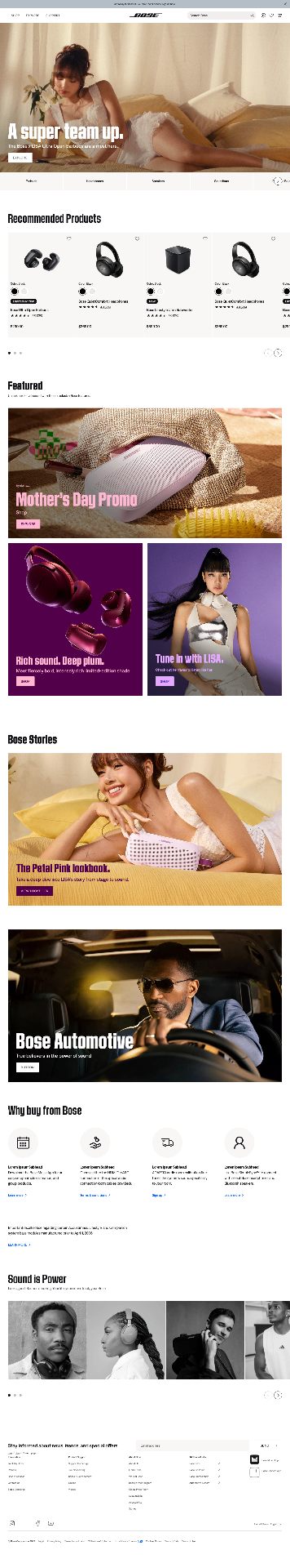
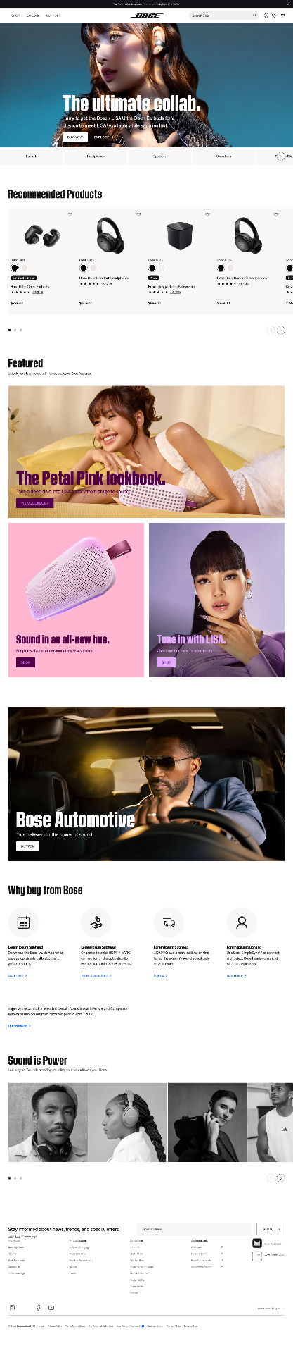
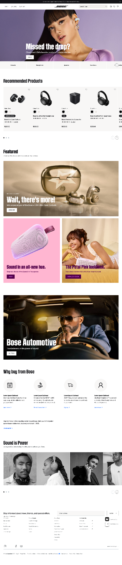
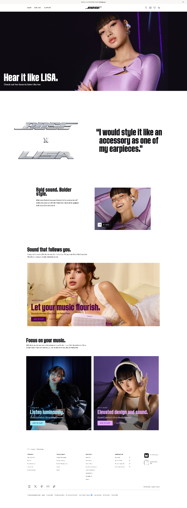
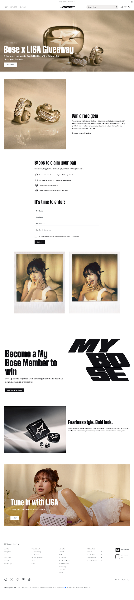
Bose × LISA — Designing a Scalable Global Launch Experience
Led end to end UX strategy and UI design for the global launch of Bose's Custom Ultra Open Earbuds with K-pop icon LISA, shaping a multi-channel digital experience built around measurable, intent-driven touch points.
- Client
- Bose
- Role
- UX Strategist · UI Designer
- Duration
- May 2025
- Team
- Figma · Miro