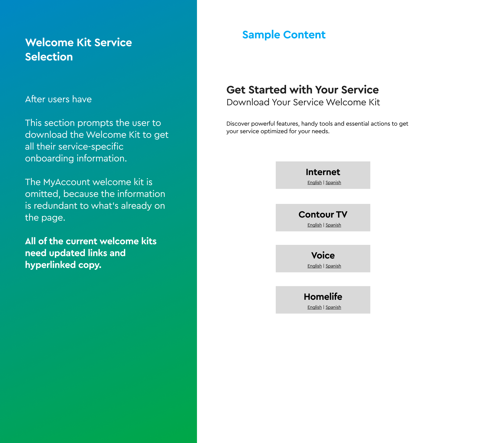
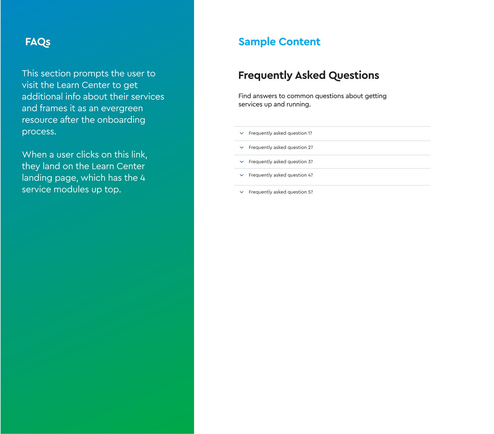
← Selected Work
Consumer · Onboarding · 2024
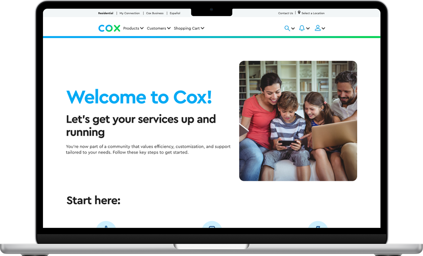
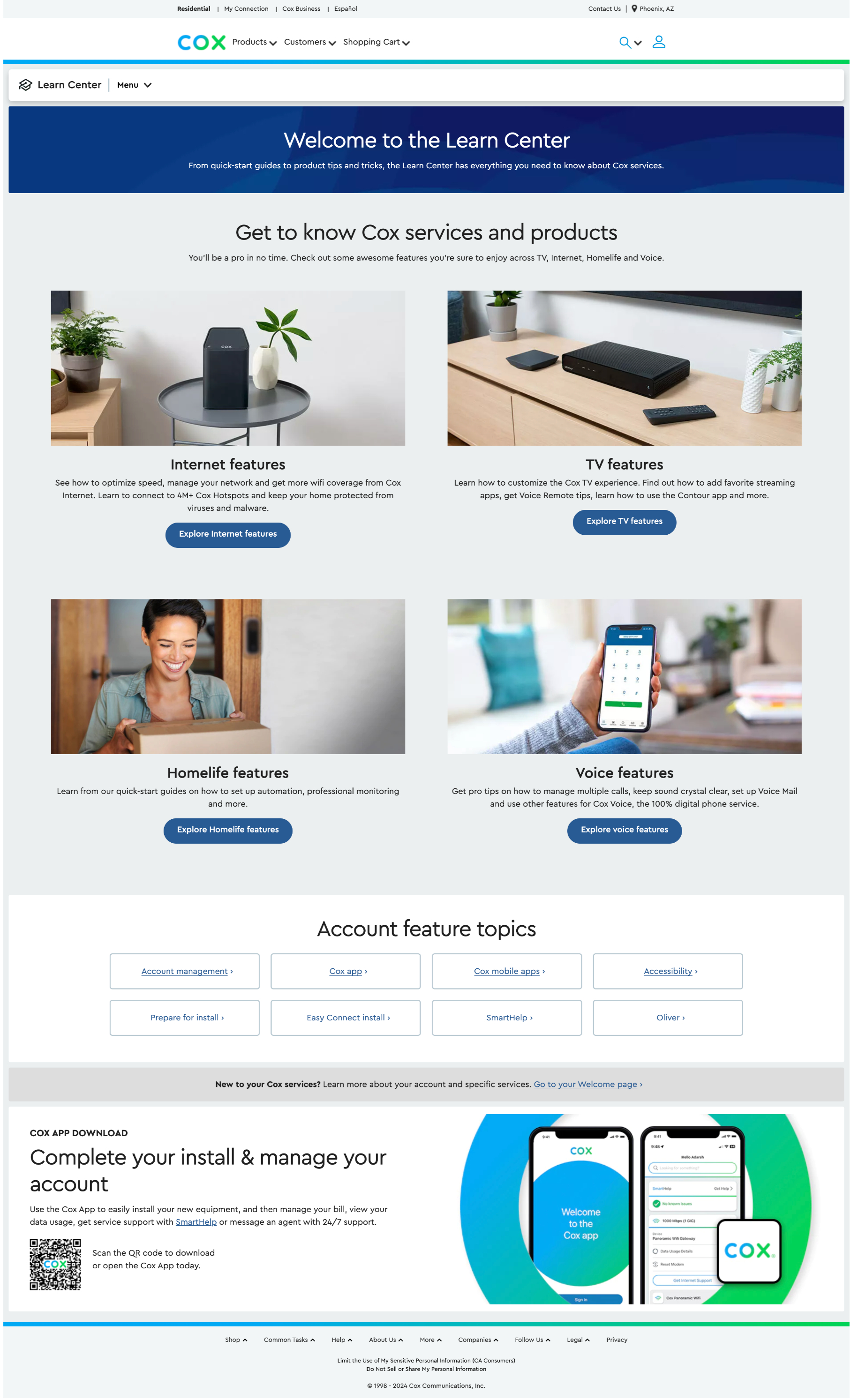
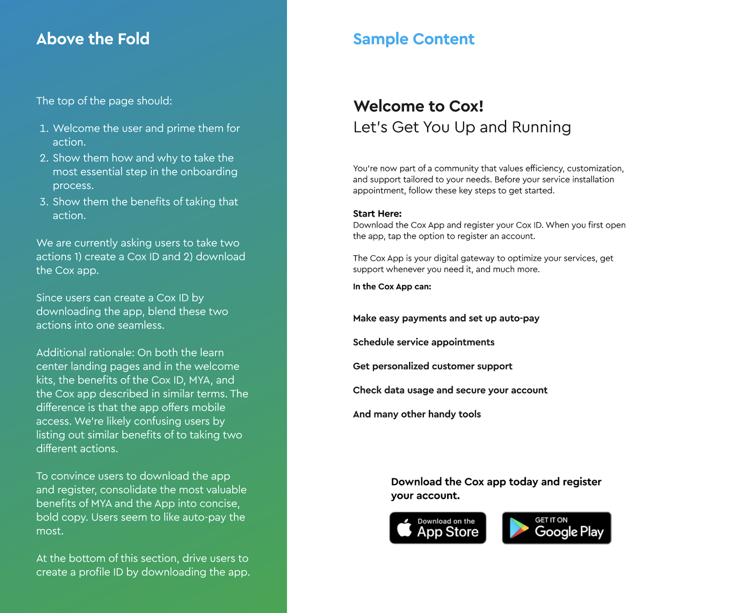
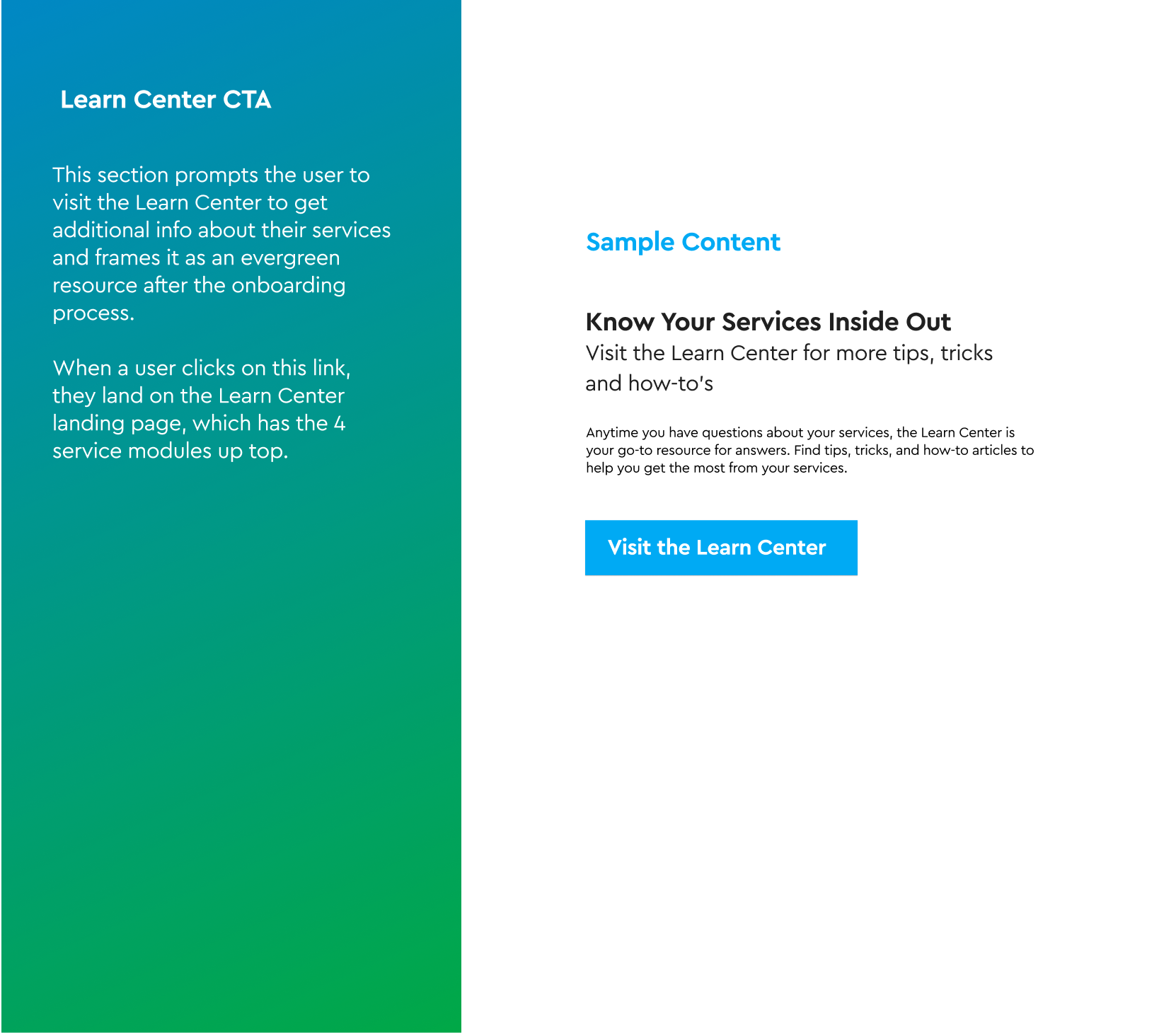
Cox Welcome — A focused onboarding experience for new residential customers
Consolidated two overlapping pages into a single, customer-first onboarding destination — replacing technical jargon and clutter with a guided experience that helps new customers reach value faster.
- Client
- Cox Communications
- Role
- Lead UX/UI Designer · Project Manager
- Duration
- 1 month
- Team
- Content · UX Research · Stakeholders